Over time the lovely website design that has served you so well will start looking a little jaded. Changes in technology, user behaviour and colour fashions will make you look critically at your web design and plan either a complete overhaul or tweaks to the layout or features.

The rise of mobile and responsive web design
The most important change in recent times has been the rise of mobile. Modern smartphones are now mini-computers and mobile network coverage speed with technologies like 3G and 4G mobile broadband Internet has meant that websites are viewable and usable from mobile phones.
Google own the Android operating system so it naturally pushes Google search and voice search (without breaching anti-trust laws). Apple’s iPhone has equivalent Internet browsing apps and large high resolution screens that enrich the mobile Internet experience.
While the rise in mobile has in part been driven by an increase in developing nations as average worldwide mobile Internet is at about 51% compared to 44% for desktop.

Source: http://gs.statcounter.com/platform-market-share/desktop-mobile-tablet
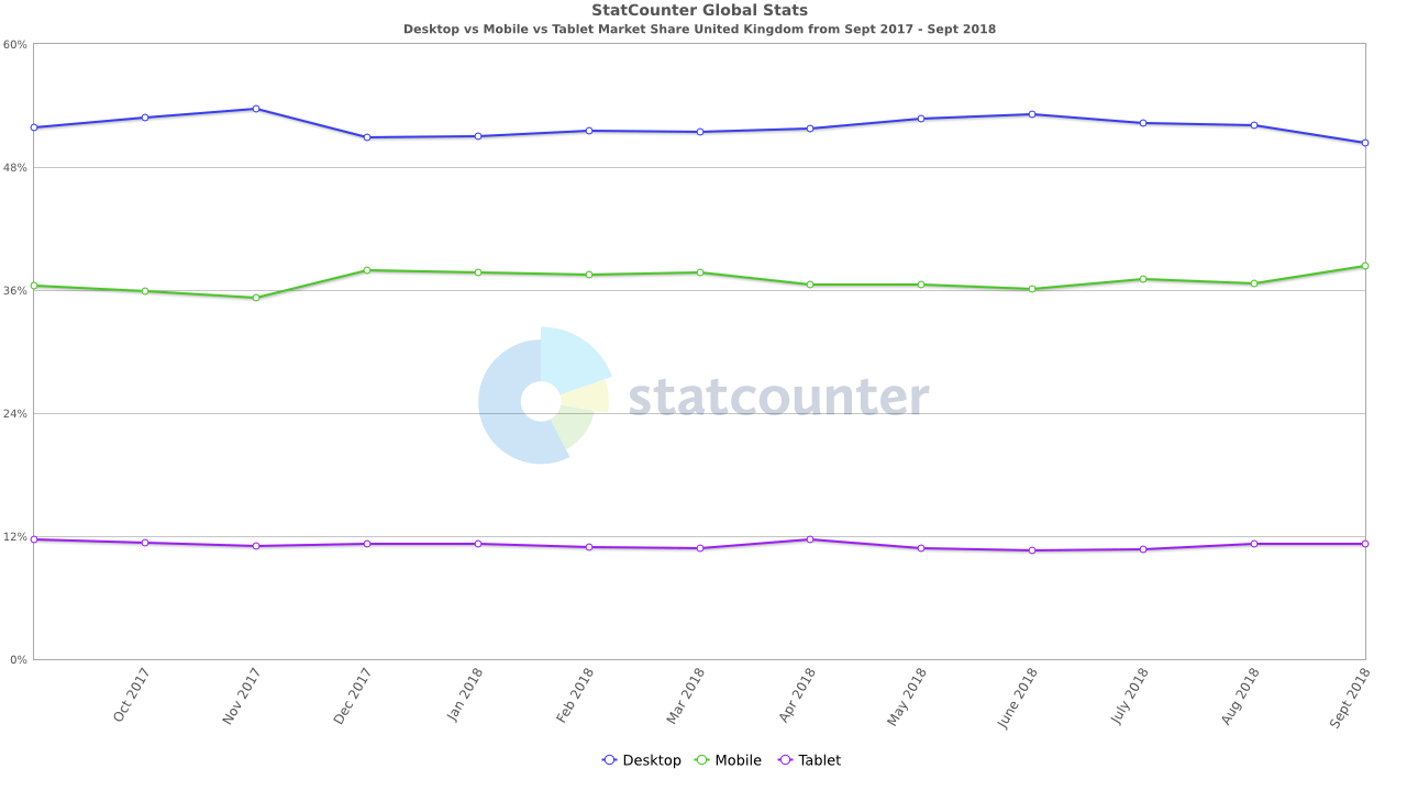
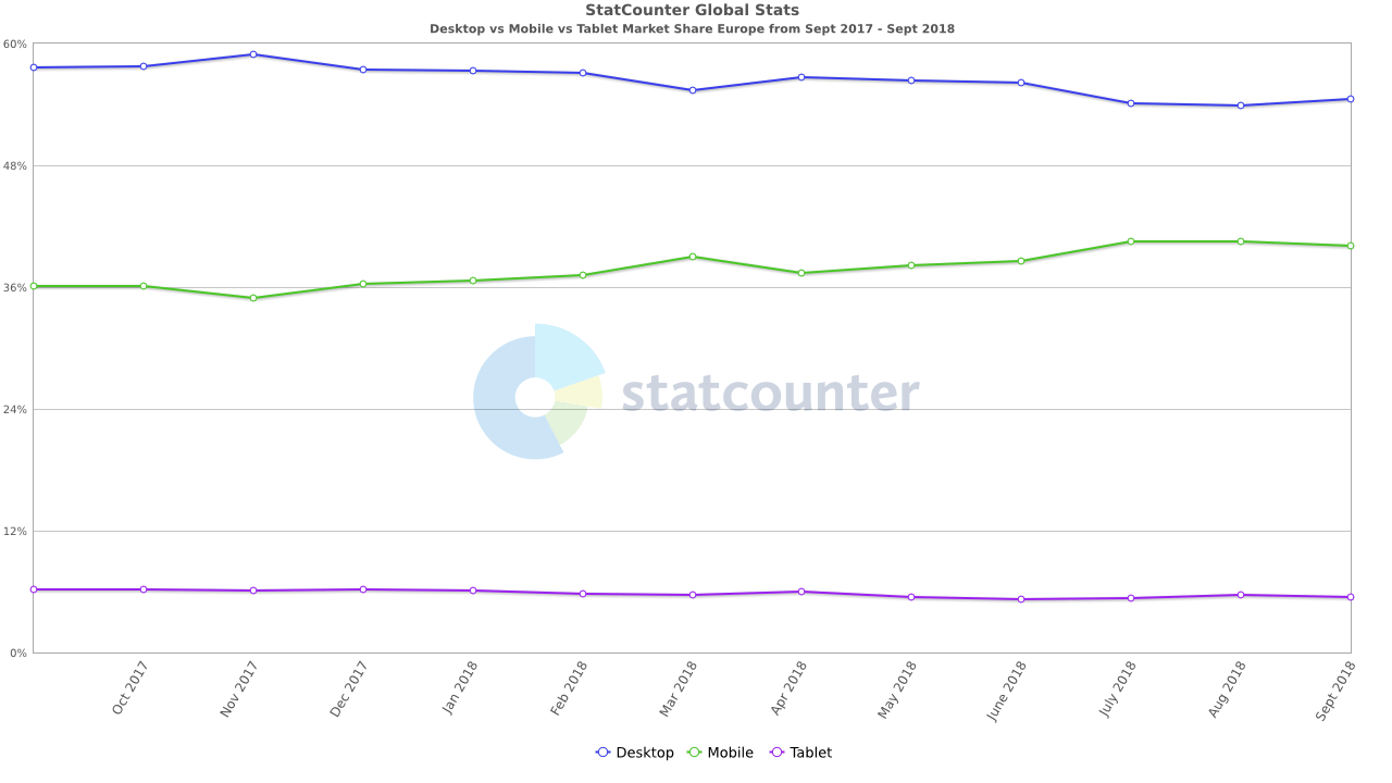
This changes to 50 to 54% for Desktop in the UK and Europe:

Source: http://gs.statcounter.com/platform-market-share/desktop-mobile-tablet/united-kingdom

Source: http://gs.statcounter.com/platform-market-share/desktop-mobile-tablet/europe
Therefore your website should cater for mobile and desktop users and use a responsive design that adapts to both. From a design perspective this places extra constraints on layouts, graphics and content.
Large images, background textures and frenetic animations may work with desktop broadband users but this will annoy mobile users. Your mobile website should also look part of the same family as the desktop version. The content should be exactly the same because of mobile first indexing.
Mobile first indexing
In March 2018 Google announced the launch of mobile first indexing.
Mobile-first indexing means that we’ll use the mobile version of the page for indexing and ranking, to better help our – primarily mobile – users find what they’re looking for.
Some website owners may have already been informed via Google Search Console, some may not even have noticed it’s happened (See Google webmasters rolling out mobile first indexing for more information).
This makes the case for responsive design and checking your website works well with mobile even more compelling. This should match your content for other devices otherwise you risk it not being indexed by Google. See our earlier blog post on Mobile First Indexing.
Changing technology
Sometimes updates to third party services can affect your website. It may be plugins or applications for your Content Management System that need updating or other changing technology.
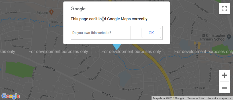
For example websites that use Google Map location markers may have experienced issues with the loading of the map:

This is because Google have changed their policies regarding people using their maps on their website. A new pricing policy went into effect on July 16, 2018 for Maps, Routes, and Places.
Google is now charging higher volume users, but in effect most users will be unaffected.
However the error message we are seeing more of is a result of the developer not enabling billing and using a valid API key to identify their account in the code. There is a monthly $200 credit for all users on a pay-as-you-go model which covers the following:
- 28,500 Dynamic Maps web loads e.g. A real estate website that helps users view homes and surrounding neighbourhoods by embedding Dynamic Maps.
- 100,000 Static Maps web loads e.g. An automotive website that helps users locate its dealerships with Static Maps.
- 25,000 Static Street View web loads e.g. A travel planning app that helps users explore a bus stop with 360° Street View imagery.
See more information at this link: https://cloud.google.com/maps-platform/pricing/
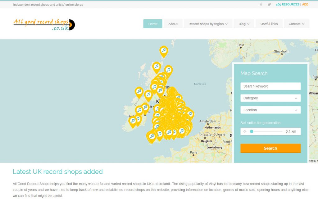
We recently had this issue on a website we developed, Online record shop directory All Good Record Shops – http://www.allgoodrecordshops.co.uk/
We generated an API in an attempt to hard code it into the current website but soon realised that it would be more efficient to update the theme and migrate the existing record shops data. Everything went over nicely and maps now work perfectly. Although the website is quite busy we are not in danger of exceeding the monthly $200 credit just yet!

Migration to SSL / https
Major web browsers such as Google Chrome, Fire Fox and Edge now mark all non-SSL pages as insecure if they require a login or other transfer of sensitive personal information. This includes e-commerce websites, membership websites and social media sites.

If you run anything like this type of website, then you should migrate to SSL so your website address changes to https://

Although, strictly speaking, it isn’t a web design job, it’s a good opportunity to review your website and revamp your web design as the work should be carried out by a skilled web developer.
Migration to SSL is relatively straightforward for WordPress websites say, but it needs to be done properly. Common issues include the following:
- Mixed content errors – secure and insecure content on the same pages.
- Old pages not redirecting to new secure pages.
- Old insecure SSLs not redirected.
- Updated URL not logged with Google Analytics and Google Search Console.
Update a tired web design
You will one day look at your current web design and wince a little and think it should be so much better. We can help at this difficult time – see our web design page!
Please get in touch if you have any further questions about our web design or SEO services and contact us.


