Let’s look at the possible web design trends for 2019. At the start of the New Year it’s natural to look critically at your website and branding and pick from the following options:
- Does my website need a full update encompassing content, layout and features?
- Will the website benefit from some minor adjustments to the layout, additional sections or some additional features.
- For the short-term do we need simply to audit and correct content for accuracy, spelling, messaging, permissions for images and other media?
- Do nothing.
Whatever your budget or resources, doing nothing is most definitely not the right option for an ambitious business.
Google’s recent quality guidelines emphasis and Medic update mean that the search engine will boost websites that can demonstrate good quality information that is accurate and from an authoritative source.
Changes in Google and search that impact website owners
2018 saw developments in the user market and Google’s policies that means you should keep reviewing your current website and assess whether it is representing your business effectively:
- Google is moving over to Mobile First Indexing to encourage everyone to use responsive websites – see more details Google clarifies what it means by mobile-first indexing for SEO
- Google Chrome and other browsers started marking all website not using SSL as insecure – see more details All http to be marked as not secure in Google Chrome
- Mobile usage increased in 2018.
- Voice search is becoming significant with the boom in smart speakers.
With this is mind let’s look at some of the most likely web design trends for 2019.
Web design trends for 2019
These are compiled from a selection of good blog posts that we think we will see more of in 2019.
Simple design to let the branding shine
It is very easy to get carried away and over-design a website, when in fact the most important first impression should be the company branding. The website should be sympathetic to the colour scheme and branding and ensure that this is recognised and remembered by the website visitor.
Distinctive fonts for body text and headings
Gone are the days when we talked about web safe fonts and you had the choice of 4 (really). Nowadays, Google fonts means that there is a huge variety of fonts available, all with different advantages. Some are great for headings, some are great for high impact text, some better for body text for readability – choose wisely. There are speed issues but the slight hit on performance is worth it.
e-commerce and minimalism
We started to notice a few years ago that e-commerce sites were all starting to look very similar, and that trend is set to continue.
E-commerce customers aren’t necessarily impressed with a quirky video or multiple pop-ups. They want a fast, secure, reliable web site, with excellent search facilities, good product images and detailed information where appropriate. Shopping cart, checkout and account pages should be clear and functional.
Design and branding is important but the investment of resource is in creating a fast, efficient and slick process leading to an eventual payment.
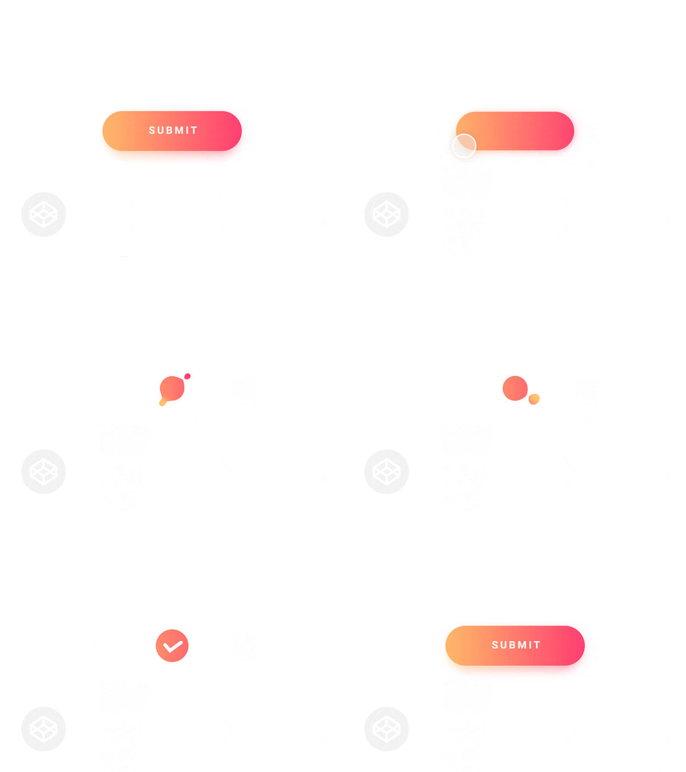
Micro-interactions
Micro-interactions are parts of a web page that require user intervention to reveal or jump to content.
A very simple example is a form providing feedback that it has been filled out correctly, but it can also include much more sophisticated interactions such as hover and scrolling animations, chimes, and much more.
This is a way to involve your audience in your website, to transmit information to the users about their actions and usage, and make web pages feel a little smarter.
Scrolling and lazy loading
Pages can be long and scrolling is fine. All websites must be responsive now, so single columns create less of contrast between the desktop and mobile version of a page. Within that single web page you can create grids and columns but these are generally aligned with each other and should not move independently.
Where you have a long page, offscreen content needs to deferred until the content is scrolled to in the viewport – this is referred to as lazy loading. See more details here https://developers.google.com/web/fundamentals/performance/lazy-loading-guidance/images-and-video/
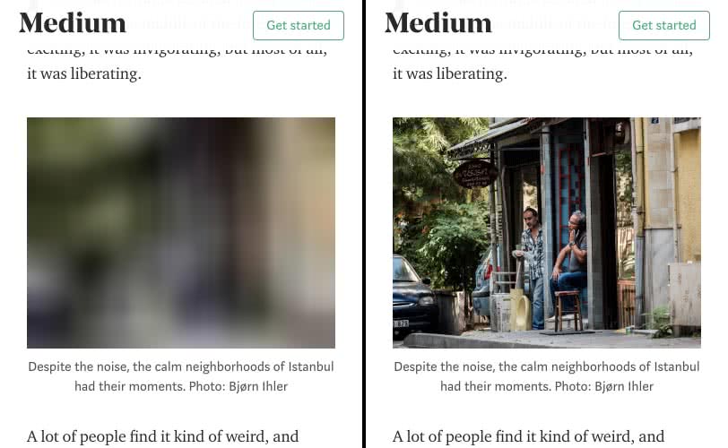
You’ve probably already seen lazy loading in action, and it goes something like this:
- You arrive at a page, and begin to scroll as you read content.
- At some point, you scroll a placeholder image into the viewport.
- The placeholder image is suddenly replaced by the final image.
An example of image lazy loading can be found on the popular publishing platform Medium, which loads lightweight placeholder images at page load, and replaces them with lazily-loaded images as they’re scrolled into the viewport.
CSS3 Animation
Animation is one of the most powerful trends in web design and will get highly popular among designers and users. The use of CSS3 technology makes traditional web design more vivid and easy to use.
Since CSS3 animation is considered relatively new in the UI field, there is more room for its development in the application of web design. It is therefore logical for CSS3 animation to be used and developed more in the coming year (see more details here https://www.mockplus.com/blog/post/web-design-trends-2019)

Image Source: Submit button by ClaudioScotto
These are just some trends we expect to see more of in the coming year and we will probably set up for our new client websites.
All of these trends are chosen not because they are intended to impress but will enhance the user experience, improve communication and encourage users to return.
Get in touch with Dinesh on 07941 686113 if you need help on web design, web hosting, SEO services, domain names or email marketing.


