It’s that time of the new year when we need to look forward to the best web design trends for 2021. The less said about the terrible pandemic year of 2020 the better. However what it has shown is the resourcefulness and innovation of people and the ability of the Internet infrastructure to deal with increasing bandwidth demands of streaming video and music, business, educational and communication with family and friends.
The new normal will inevitably influence how websites will function and what design and layout features can optimise the user experience. Here are the best 5 we have found (numbered, but in no particular order).
#1 A web presence will be even more crucial to running and promoting your business in the Covid-19 pandemic
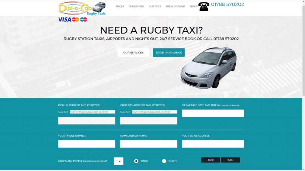
The technology and means of delivering are a side issue; pretty much anything you can think of can be done within a realistic budget.
These days of lockdowns, social distancing and protecting the vulnerable means that your web presence must take the place of face to face contact with customers.
Delivering features like enhanced communication, online ordering, click and collect, online appointments, online events is now very affordable with content management systems like WordPress and its vast catalogue of plugins. Also recent web technology can provide usable of useful bespoke features for your website.
This type of innovation is well within the budget of small to medium sized businesses and necessary to minimise or control close contact with customers. In these strange times we may have to keep our physical distance but this doesn’t mean stopping communication.
#2 More readable text with toned down backgrounds
While we like nice images, animations and video, your web pages need to be readable. This means reducing eye strain.
Web designers have been taking this into account with colour schemes that are focused on being easier on the eyes. There was a trend (unwelcome for me) last year for dark mode where websites started using dark backgrounds with light coloured text.
“In 2021, web designers will be thinking outside the two extremes of dark and light. They are finding middle ground in soft color palettes, like wholesome greens, pastel blues, warm browns or light pinks. These not only make website colors less jarring than pure black or pure white, they naturally induce calm and relaxation.”
This trend overall is a hopeful sign that web designers of the future may be more concerned with accessibility and comfort than dramatic innovation.
#3 Web design for causes
Donation sites for charities, petitions and other campaigns have highlighted the value of websites in generating interest in good causes and raising money.
Captain Sir Thomas Moore used a standard Just Giving page to eventually raise over £30 million for the NHS in the UK during lockdown. Other campaigners and fundraisers have used websites to create multimedia rich and impactful content to educate and inspire action.
#4 Multimedia experiences
Most people now have access to faster internet speeds multimedia web experiences are popping up everywhere.
Bringing together visuals, text, video, and audio makes for a rich user experience, however it’s important to exercise restraint.
- Prioritize simplicity, like when combining motion and audio. Too much going on can be distracting or overwhelming to people with cognitive disorders.
- Use different media formats thoughtfully as a way to maximize accessibility of content.
- Include closed captioning and transcripts for all pre-recorded multimedia.
- Include alt text for images, and accompany complex images with longer descriptive text.
- Ensure that all text is made with HTML rather than rendered inside images.
- Avoid autoplaying video or motion content: instead, provide a clear “play” button that affords the user the option to play and pause the content.
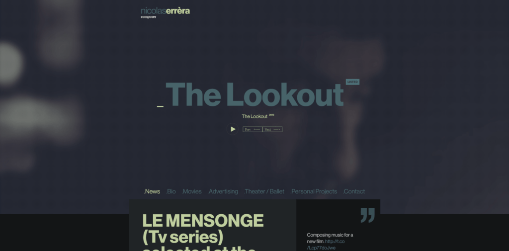
Composer Nicolas Errera’s site includes playback controls for a beautiful background video: it plays on click, and can also be paused.
#5 Typography and icons
The human eye is still drawn to images and the unusual, so don’t be afraid of using today’s wide selection of fonts for headings and text. Still prioritise readability for body text but the rest is really down to your design and what is good for the client.
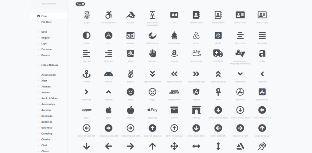
Icons are a good way of signposting something without using an image or words.
Install and the excellent font awesome library if you want to use their free icons: https://fontawesome.com/
 Get in touch with Dinesh on 07941 686113 if you need help on web design, web hosting, SEO services, domain names or email marketing.
Further reading
Web design trends for 2021 from 99 designs
Web design trends 2021 webflow
Photo by picjumbo.com from Pexels


