As it’s Halloween, let’s delve into the darker side of web design and reveal our top 5 scariest things your web designer can say to you.
We have put these in roughly descending order, but to us they’re all quite scary. When faced with this type of statement don’t split up and search for clues to solve the problem (Scooby Do style). Stay together and find a better web design company.
#1 It’s ok we’ve done the animations using an old copy of Macromedia Flash
Flash animations used to be everywhere. There’s many a dreary hour in the past I’ve spent visiting a website and then having to wait for the flash introduction to finish doing its thing. Get past this and we’re off into the nightmare vision of the over-enthusiastic web designer who thinks that every link or point has to be illustrated by something moving on screen or appearing then disappearing.
Flash was great for little games or specific interactive features but website intros are an absolute no no as they are self-indulgent and time wasting. The search engines ignore flash content and there are potential security issues too.
In this day and age, animations and movement can be easily created using the latest technology HTML5, CSS and jQuery.
#2 We do our own web hosting using a server we manage from our office
Web hosting is specialist activity where you are fighting an ongoing arms race with hackers as well as continuously improving speed and reliability. Beware anyone offering their own web hosting equipment as a sideline to their main expertise.
We offer web hosting, but that is through a reseller account with a large hosting company. That way we can offer great value web hosting that is fast, reliable and secure. We also make use of their excellent 24 / 7 technical support that we couldn’t possibly deliver if we had to keep our own web server continuously patched and updated to maintain performance.
#3 We have developed our own content management system in house
In this day and age there are excellent open source and commercial content management systems such as WordPress, Drupal or Joomla that enable web designers and developers to setup slick, beautiful and functional websites.
The widespread use means that there is an active eco-system of developers that maintain and update the core content management system.
For example, WordPress has advanced from version 4.5.3 in June 2016 to version the latest 4.6.1 at the time of writing. These are improvements to security and functionality that make WordPress easier to use and more secure for website visitors. The WordPress eco-system also has an active community of developers producing plugins and themes that help you enhance the functionality of your websites.
If a company develops their own content management system then you risk the system falling into disrepair if key people leave or enhancements being very expensive. Even with a talented team of developers an in-house Content Management System could never match what is available in freely available open source products.
#4 We reuse the same web design template
Henry Ford once said “You can have any colour as long as it’s black”. He meant that their basic model T Ford was offered as a functional but mass-produced item that worked fine as a relatively cheap way of many families owning a car. Unfortunately each business, small or large is different and their website should reflect that.
A web design company having a certain fixed style means all their websites start looking the same and take no account of the individual needs of a client. There is nothing wrong with using commercial templates or standard layouts but to use the same one time and time again means that your website could easily start looking like someone else’s.
#5 We couldn’t get exactly the right font from your design so we’ve exported the text as images
We have seen websites where blocks of text have been reproduced as images. This ignores how search engines work as search engine bots figure out what a website is about by scraping text from the pages.
Substitute text for images and search engines can no longer ‘read’ and extract the keywords from your web pages easily. This will lead to your website falling in search rankings. Headings and tables can often be reproduced this way but that is unnecessary and not recommended.
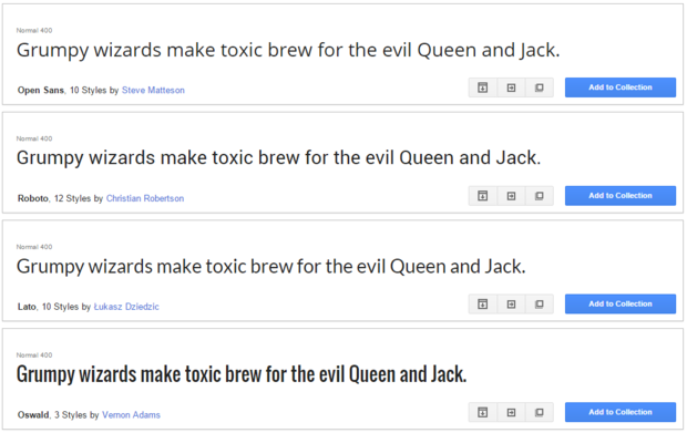
Even if a web design has specified a particular type of font there is a wide range of fonts that you can use on your website courtesy of Google fonts. This mean all types of font can be displayed as text in web pages without compromising on design.
That’s just five scary things a web designer can say to you. Faced with these at Halloween or, in fact, any other time you should be afraid, very afraid.


