The relationship between E-commerce and web design is often awkward.
From the early days of Amazon, where the term ‘web design’ was at best loosely applied to the most basic of layouts to the over-designed insanity of ill-fated boo.com (https://en.wikipedia.org/wiki/Boo.com), e-commerce web design has always struggled to get the credit it deserves.
The only key performance indicator that matters: revenue
This is largely because the only performance indicator that matters is revenue. An e-commerce website that doesn’t generate orders, no matter how beautiful or award winning, is not doing its job. Other indicators like bounce rate, web traffic and pages per session are important but don’t matter as much in the final analysis.
For us, the term e-commerce web design includes both the appearance and how a website is used. The website’s main job is to present the visitor with enough information about the product to make a purchase. The rest of the web design includes the layout and style of the shopping cart pages, account registration and payment.
By now, the scope for making any major leaps in web design for any of these elements is limited by giving people something familiar. This is so they don’t have to think too much about following the stages successfully to the point of the order processing successfully and money being transferred.
This doesn’t mean that there aren’t opportunities for distinctive web design at these different stages but these must be within constraints of what people expect and are familiar with. For example car dashboards vary enormously but the basic layouts need to be the same: speedometer, petrol gauge, rev counter etc.
Here are some of the best trends in e-commerce web design that we expect to see in 2018.
#1 The product and customer are the stars
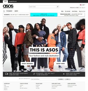
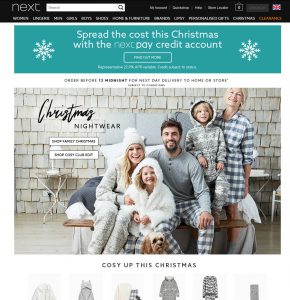
Look at these home pages from major retailers Next and ASOS:


Apart from the logo and branding, you could be forgiven for mistaking them for the same website. The black top bar and reversed out logos are followed by a compact ‘hero’ type images. The images depict what each company thinks are its target market and uses their branding only sparingly.
The main lesson here is once someone is on your website, the branding should take a back seat in preference to showing the products and appealing to your target demographics.
#2 Navigation and search autocomplete
Menu and navigation are very important. Often e-commerce websites have very large mega menus with direct links to product categories. Users will be quite happy to open up the full mega menu and make the choices from there.
We have seen the use of the mobile three line hamburger menu used quite effectively on desktop versions of websites to save space.
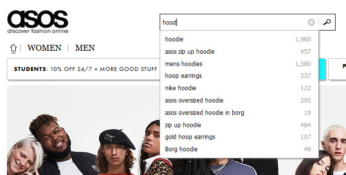
Where you have a search box, autocomplete should show related searches. The ASOS top search bar is quite sophisticated as it shows indexed related searches with the number of ‘hits’.
Those brought up on Google will find this feature familiar and useful, however it’s important that it provides search hints.
#3 Prepare for m-commerce, tablet use declines
In the UK online retail sales topped £133 billion in 2016, beating expectations with a 16% jump from 2015, according to the latest e-Retail Sales Index from Capgemini and IMRG.
This was 5% higher than the firms initially forecast and reverses a trend of slowing online retail sales growth in the UK in recent years.
That high growth was chiefly driven by a sharp rise in retail sales made on smartphones. In December 2016, e-commerce sales via smartphones rose 47% year-over-year (YoY), compared with a 3% decline in tablet sales YoY.
It would be interesting to see further demographic breakdowns as the received wisdom seems to be that millennials are abandoning PCs and laptops in favour of smartphones (but not tablets).
There are still practical difficulties with m-commerce as people still have to enter product names, payment credentials, and shipping information accurately. This means that voice controls might play a role in the future.
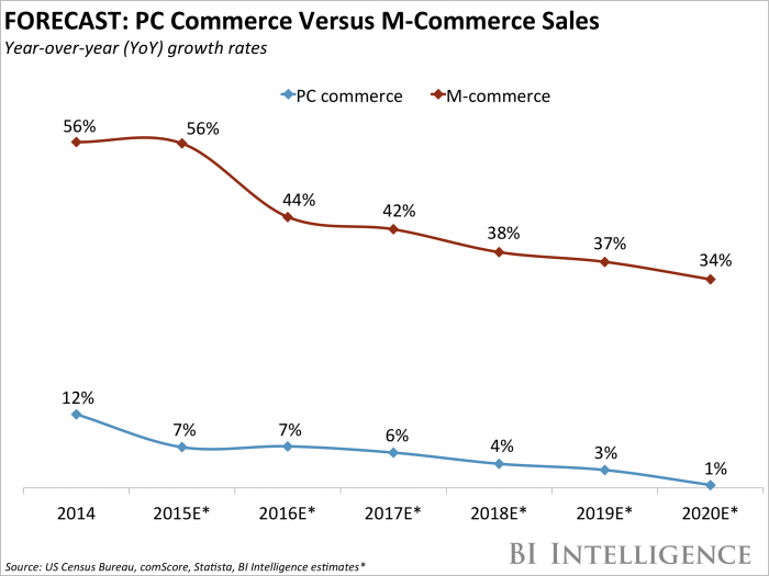
It is still too early to predict the demise of PCs / laptops in e-commerce. BI Intelligence predicts that YoY growth of both m-commerce and PC commerce will continue to grow but decelerate. M-commerce will grow at a high rate with PC commerce slowing to saturation by 2020.
#4 Website speed increasing importance
This is an ever-present trend. Your site needs to work on multiple devices and display as quickly as your web hosting and website code and assets can deliver.
Use Google Analytics and Google site speed check to continuously review your site for performance drops. You should also seek opportunities to enhance the speed your website displays across all devices, platforms and Broadband speeds.
Some of this might be procedural such as ensuring your editors optimise images, clean up text
#5 Engage your users with visuals
Having stressed the importance of site speed, you still need to describe your products with compelling titles and descriptions but more importantly images and video where appropriate.
The web is first and foremost a visual medium and while people will take the time to read lots of words once they have convinced themselves that it is worthwhile. That’s where images and video play a major role. In engaging interest, illustrating the product and encouraging people to read further and in-depth.
These are just some e-commerce web design trends we expect to see in 2018. Please visit our web design page for information on our services and get in touch with us through our contact form.


