Your web design is primarily for your website users, but you also need to make sure that search engine bots can find their way around it. Others are entitled to their opinions such as senior company personnel, PR and marketing departments etc, but it’s the user experience that trumps everything.
The role of web design
Web design plays a crucial role in boosting the user experience which then benefits the quality data that search bots gather from your website. While a website should carry through the company branding and colour scheme there is a practical job to do first and foremost:
- Inform the user about products and services.
- Encourage users to use the calls to actions – phone calls, enquiry forms, buying online, commenting, uploads, engaging other users etc.
- Encourage search engine bots to index your web content and gather information about your website.
Web design limitations
The design of your website is constrained by these objectives. Also the user can be using a PC or laptop, smartphone and tablet and is no longer impressed by irrelevant graphics or animations. This can mean that that websites are starting to look quite similar.
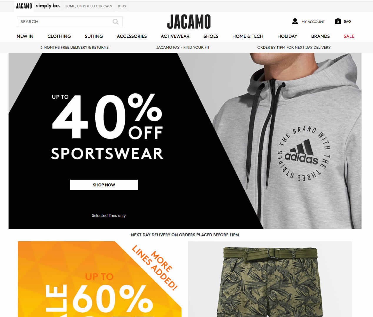
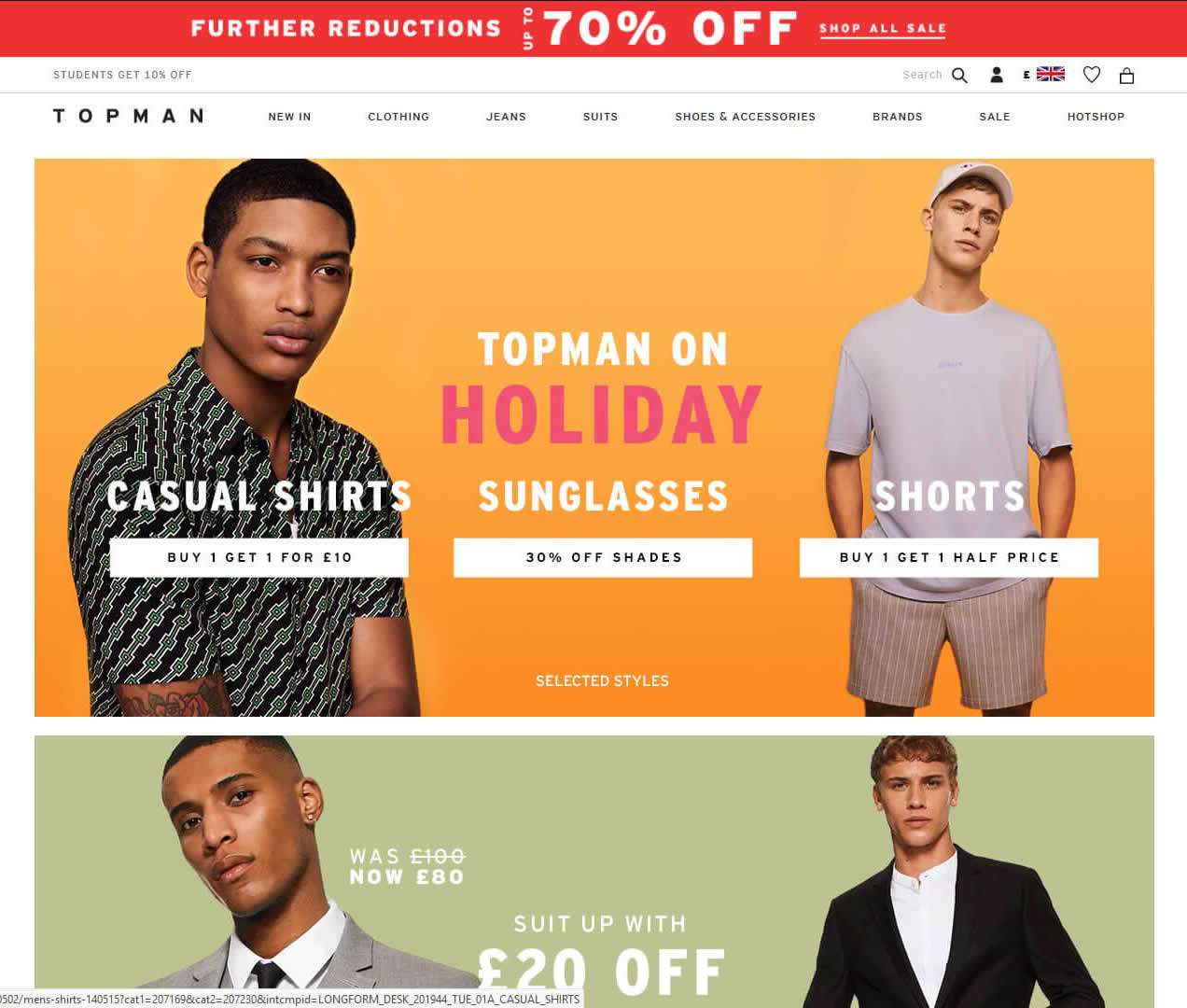
This trend is particularly marked in e-commerce websites:
Here is men’s clothing website Jacamo:

Here is men’s clothing website Topman:

Spot the difference!
In my view the web designs are interchangeable and are subservient to the main objective of enabling users to search for and view products and search bots to crawl the website.
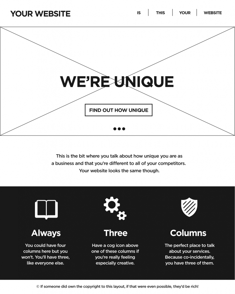
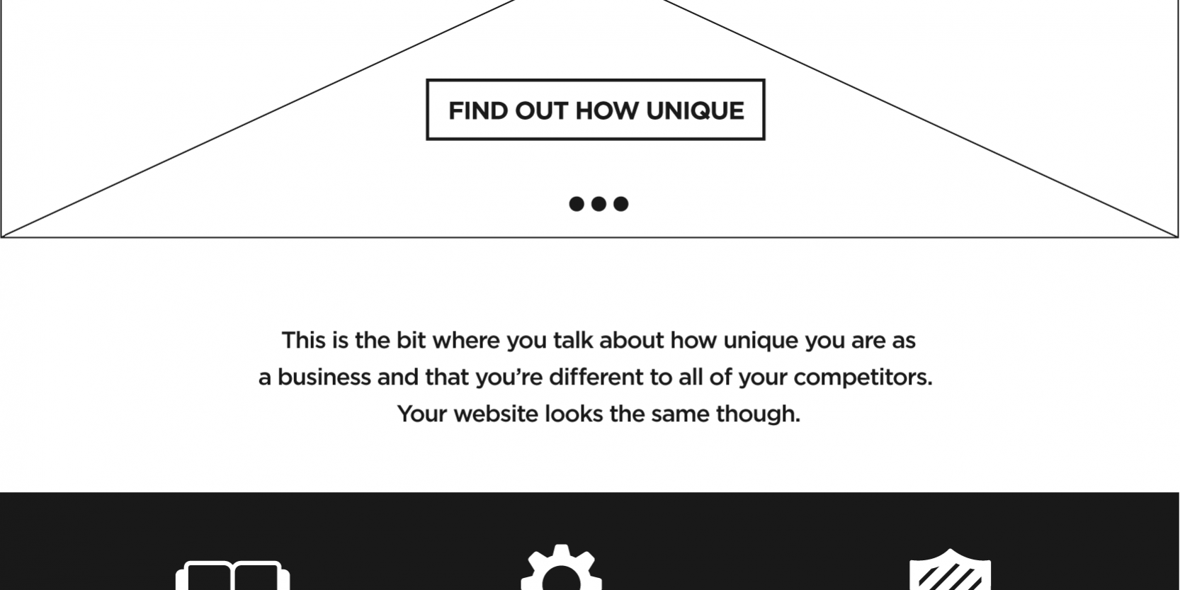
This conformity is not so prevalent in the corporate world but web designer Dave Ellis identified this trend with his ironic ‘We’re Unique’ template.

Source: Dave Ellis
Within this template there is scope for adding a bit of individuality in design of sliders, header image and icons etc but this all looks very familiar.
The age of responsive minimalism in web design
Web Design now is ‘Responsive’ – which mean dealing with the different size demands of smaller, portable gadgets so images resize, text wraps and flows and the website has only one main column.
Which means it can employ tasteful uses of white space.
The careful use of nothing has always been important in traditional Graphic Design and Typography. The inclusion and aesthetic use of white space – of areas where there are no images and no text – has long been a signifier of elegance and affluence. On paper, space is a premium, so wasting it is a statement of decadent luxury.
In Web Design, active white space (that’s white space which is deliberately employed as a design choice) helps keep the pages clean of clutter and makes the content more impactful.
Interactions, video and animations
While web design might be heading in a minimalist direction individual elements on the page might be added such as tabs, video and animations.
In fact the more minimalist the web design the more you can justify using these micro-interactions.
There is still a huge amount of scope for creativity and making websites that look great. The main differences now are the demands of the more Internet savvy users using different devices.
Get in touch with Dinesh on 07941 686113 if you need help on web design, web hosting, SEO services, domain names or email marketing.
Further reading
Decoration vs minimalism: where is web design fashion going next?


