When you design or write a brief for a new website design it’s very easy to forget the user. It’s difficult to test website user experience, it’s very easy to get sidetracked by your own views on colour schemes, branding and other features.
The most important stakeholders in any new web design or enhancement to an existing website are your users. Their user experience is what keeps them on your site and sharing links. These are all strong ranking factors for search engines so can boost your SEO and rankings if you get it right.
It isn’t possible to sit on the shoulder of users observing how they use your website but there are some techniques and services you can use for testing website user experience and first impressions. This is very useful if you in the process of a new web design project or enhancement to existng web pages.
Testing website user experience and first impressions
It’s hard to be completely objective, but try to put yourself in the shoes of someone viewing the website design for the first time. Without any prior knowledge of you or your business what might be the first impression? Do the headings and menu links make sense and is the website creating the right impression for your audience? Doing this is objectively is difficult but here we describe some ideas and techniques for testing website user experience.
The blur test or distance test
Display the page you want to test and then squint, noting what features stand out when you can’t see a clear view of the image. Alternatively take a screen grab using the Prt Scr of your keyboard, drop it into a good graphics package like Gimp, Fireworks or Photoshop and apply a Blur filter.
The thing that stands out the most should be related to the purpose of that page. For example, if you want to gather email addresses to generate leads, then the email sign up form should stand out the most.
Blurring a page will reduce it to a bare bone representation of the layout, and should highlight a call to action.
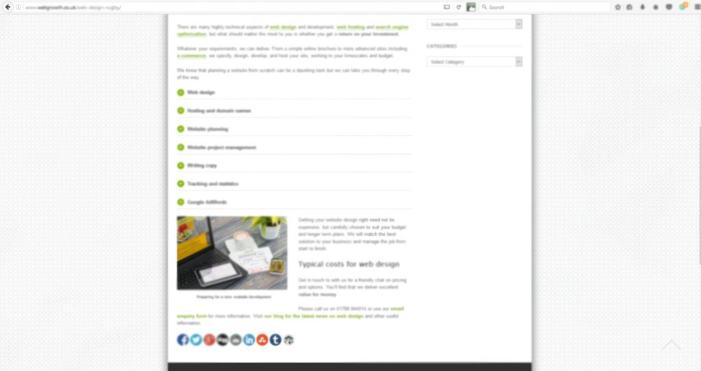
Here’s a blurred grab from our web design page:
We recognise from this test that it’s a purely informational page and we need to make a clearer call to action. This is on the to-do list!
Another way of achieving the same effect is the distance test. Do this by displaying a web page on the monitor and step back a few metres so you can’t see the page detail but can still see the page elements.
If your page can’t pass the blur test, then your page objective isn’t being clearly communicated to the user. You need to make it simpler.
The five second test
This is a free test where you show someone a screen for five seconds and then ask them what they remember about the page. This is a good way of getting feedback on first impressions and how they perceive the main purpose of the web page.
Alternatively this commercial service – Five second test – helps you test a website with real people.
Heuristic testing, ‘testers assemble’
This is a standard user experience test. The idea is you find some willing volunteers drawn from colleagues, friends and family. Once assembled set them a general task that they have to perform without any instructions.
If you are testing an e-commerce shop then you could ask them to try buy a product or register their account. You might also ask them to submit an enquiry about a particular product or service or find more information on a particular topic.
Ask them to be honest and report any problems they had or parts of the page that weren’t clear.
Online user testing
There are commercial crowdsourced usability testing services that provide feedback from testers as they use your site. This type of user testing allows you to ask the visitor to complete tasks, comment out loud on their thought process, and at the same time their screen is recorded.
It’s a cost effective way of obtaining detailed information about how visitors behave while completing tasks on your website. You can find out what they’re thinking, and ask them questions too.
Try services such a User Testing or their free service Peek – http://peek.usertesting.com/
Usability testing
Formal usability testing involves a live person version of online user testing. This is where you assemble some potential users and video the screen as they use your website. They are encouraged to think out loud, describing what they are doing and their impressions of the website pages as they are using it.
Done properly this can be a time-consuming but valuable exercise giving valuable insights into problem pages or parts of your website.
Heat mapping tools
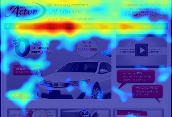
Once a new site is live there are several online tools that create a visual map of the activity on your website. Essentially, it adds an overlay over the top of your site, so that every time a user clicks, that click is recorded. Some will also cover screen visibility or mouse movement, rather than just clicks.
You can use this data to see what people are clicking on and what they should be clicking on.
There are several tools such as Crazy Egg, Click Heat, ClickTale and the WordPress plugin Heatmap for WP.
Further reading
3 Free tools to see the heat map of your website visitors


