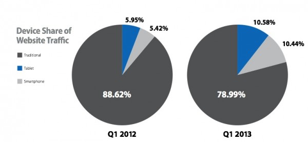
Mobile and Tablet PC website usage has exploded in the last couple of years and business owners should be planning for how to deal with this trend now. The latest statistics from the Monetate Q1 2013 Ecommerce Quarterly gives an insight on smartphone vs tablet vs desktop share of audience for large e-commerce brands.
This source is useful since it’s a regular survey showing the growth in use of mobile site visitors. You can see that tablet and smartphone use nearly doubled in the year from 2012 to 2013, based on 500 million visits for these retail clients. Mobile share for these websites is now around 25% on average.

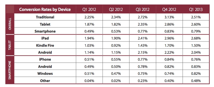
The picture is complicated by people frequently using different devices to use the same site. You might investigate a particular website using your mobile or tablet, but then the transaction might be done using a PC or laptop. For example I occasionally buy and sell stuff on eBay, and will often set up an item for sale using my PC but check bids and questions on my mobile. Therefore it’s no surprise that while tablet and smartphone use has doubled in a year this rise has not been matched by the same increase in transactions which suggests that mobile devices are used for browsing and research rather than buying products online.
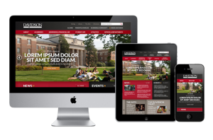
For business owners this would suggest that the option of a responsive web design is the best choice for your website. A responsive design means that your content automatically adjusts to the size of your device. You have one website and one set of content, but depending on what device you display it on, it is automatically laid out differently.
See our earlier blog article here: Why responsive web design is the best option for your website
See more statistics on mobile usage here: Statistics on mobile usage and adoption to inform your mobile marketing strategy


