Responsive web design makes your web pages display and work properly with all devices: desktop PCs, laptops, mobiles and tablets.
Responsive Web Design is about using CSS and HTML to resize, hide, shrink, enlarge, or move the content to make it look good on any screen.
Google are very clear on the benefits of responsive web design:
- Makes it easier for users to share and link to your content with a single URL.
- Helps Google’s algorithms accurately assign indexing properties to the page rather than needing to signal the existence of corresponding desktop/mobile pages.
- Requires less engineering time to maintain multiple pages for the same content.
- Reduces the possibility of the common mistakes that affect mobile sites.
- Requires no redirection for users to have a device-optimized view, which reduces load time. This also reduces the risk of errors in user agent-based redirection (see Pitfalls when detecting user agents“).
- Saves resources when Googlebot crawls your site. For responsive web design pages, a single Googlebot user agent only needs to crawl your page once, rather than crawling multiple times with different Googlebot user agents to retrieve all versions of the content. This improvement in crawling efficiency can indirectly help Google index more of your site’s content and keep it appropriately fresh.
They are also toying with boosting mobile friendly sites irrespective of the device being used for Google search. See our earlier blog post on Google mobile first indexing announcement.
We think that they still might go back to only boosting mobile friendly sites when the user is using a mobile as people might use different search terms for different devices and situations.
How to design for responsive web design
The first thing to do is think about screen layouts and how you want your content to appear. Using old fashioned sheets of paper and pen you can simply sketch how your page can display for different devices. Then you need to implement this design using the following skills: front end web development; Javascript development; CSS and web hosting management.
Bear in mind these principles when you specify a responsive web design:
- Our pages should render legibly at any screen resolution
- We mark up one set of content, making it viewable on any device
- We should never show a horizontal scrollbar, whatever the window size
Any competent web design company or web developer will be able to manage this work on your behalf. So you have a better appreciation of the process here is an introduction to some the basics behind responsive web design.
Setting the viewport
To signal to browsers that your page will adapt to all devices, add a meta tag to the head of the document:
<meta name="viewport" content="width=device-width, initial-scale=1.0">
This tells the web browser instructions how to adjust the dimensions and scaling of the page to the width of the device.
When the meta viewport element is absent, mobile browsers default to rendering the page at a desktop screen width (usually about 980px, though this varies across devices). Mobile browsers then try to make the content look better by increasing font sizes and either scaling the content to fit the screen or showing only the part of the content that fits within the screen.
Liquid layouts
A so called liquid layout fills the available space so that has an impact on the images you use on your website and how you detect the device being used. We’ll spare you the detail, but in principal fixed image sizes are a thing of the past as they need to expand or contract depending on the device. This means specifying a maximum width as a percentage rather than a fixed width in pixels:
img { max-width: 100%;}The viewport is next. This is the size of the screen being used to view the website. In the CSS file you need a section where you can specify the sizes and orientation of various page elements or whether they display at all – “display: none;” is a common CSS code that can stop elements e.g. a non-responsive slider displaying on mobiles.
@media screen and (min-width:480px) and (max-width:800px)

{  /* Target landscape smartphones, portrait tablets, narrow desktops   */}
@media screen and (max-width:479px)
{ /* Target portrait smartphones */}This doesn’t target specific brands or makes of device. It only looks at the width of the screen being used and shows the content based on what looks the best.
Once your layouts are implemented you should test them on different devices and online services.
Testing your responsive web design
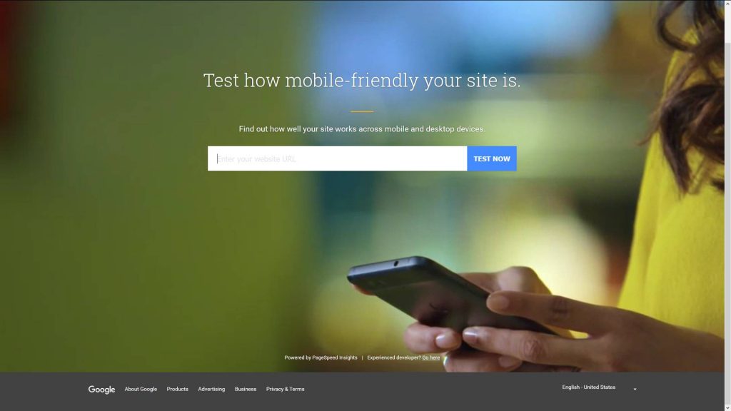
We still see small, medium sized and even large business websites where they haven’t gone to a responsive web design or the website is poorly coded and only just passes Google’s online mobile friendly test.
This is a new Google service that combines the Google mobile friendly test and speed testing for mobile and desktop into one friendlier website. There’s also a service by Screenfly that tests for specific devices: Screenfly: test your website.
When you take the plunge you should notice positive results on your business immediately. One of our clients went to a mobile friendly website this year and had a 33% increase in orders immediately and this has continued since.
Further reading
Google webmasters responsive web design


