Web design is a surprisingly controversial subject and web design trends can provoke much debate. While a piece of code fulfils its purpose and works or doesn’t (although some may argue about speed and efficiency of achieving that purpose), web design trends can make a project slow down if stakeholders disagree about a colour shade or typeface or size of page element.
Sometimes the client maybe too wedded to websites they have liked in the past and not kept up sufficiently with what is working now. They then risk asking for something that is out-dated and may damage their business long term. Sometimes the web design company may misjudge the target audience and client and produce web designs that are too far ahead of the curve or lag behind what is required.
What is true however, from the products in your house to the sites you view on your computer or mobile device, good design matters. Web design can change how a visitor perceives you, the amount of time they spend on your site, how they interact with your website and the products they buy.
An end to multiple columns
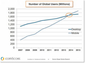
Google’s mobile friendly update and rise of mobile web use have influenced web design trends due to a recent tipping reached in Desktop versus Mobile users where the number of mobile users now exceeds desktop users. That means there is a convergence with desktop web design getting much simpler to follow more closely what people may see in the mobile version of a website.
The most obvious casualty is multiple columns. For example Google recently dispensed with the right hand column that previously hosted Google AdWords Ads and increased the number of Top Ads from three to four. They explained that change by the lack of clicks on the right hand column however the rise of mobile users is likely to be another factor as a right hand column on a mobile device usually gets pushed to the end of a page and can only be viewed after a lot of scrolling.
A move away from stock photography
How many pictures of ‘business’ people giving each other high fives can you stomach in your web design?
We all use stock photography from time to time but things start looking a little clichéd if you use too many. Taking your own product photographs by either using a professional photographer or a skilled amateur for simpler shots is almost always preferable to stock images that take time to find and often lack impact.
Diagrams and illustrations are also a good way to avoid death by stock.
Function and design; in that order
Gone are the days when users might be impressed by a funky animation or music playing over some slow loading video or images slides. The web in 2016 is a much more functional place with time-poor users wanting information, interaction or some other outcome without having to think too much or wait for something to load. This doesn’t mean that good web design is secondary, just different and must enhance the user experience rather than just impress. The importance of function and everything working as intended should go without saying but we’ll say it anyway.
Modular web design
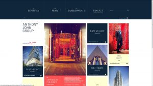
The popularity of sites like Tumblr and Pinterest has led to user acceptance of modular or card type web layouts which divides a page into separate and often differently sized cards or tiles for different pieces of content. This type of layout doesn’t suit every type of website but can be a neat alternative to endless slide shows or scrolling images.
Serif and handwriting fonts in typography
Words dictate how your website is used by website visitors and indexed by search engines. Increased resolutions and responsive designs make it possible to improve typography, which is why that is one web design trend that changes with technology and styles.
Two trends that we’ve seen with typography are the use of serifs and hand-writing.
- Serifs help improve legibility. They were removed previously due to lower resolution screens and screen size.
- Handwriting is more personal. If it’s done correctly, it’s pretty and adds a special touch to a website. Just like serifs, the challenge is to keep the style legible and readable on small screens.
These are a selection of some web design trends that we have spotted in 2016. It’s not scientific so if you have any views on these trends or any of your own then we’d love to hear from you.
Further reading
10 web design trends to see in 2016


