At this time of year, self-proclaimed and bona fide experts start to make predictions about how the latest web design trends will influence the look and feel of websites into 2016. A big influence on web design trends was the launch of Google’s mobile friendly update in April 2015. This means that a Google search on a mobile device such as a smartphone or tablet is likely to rank mobile friendly websites higher than websites that haven’t been optimised for mobile devices. In terms of web design this has effectively led everyone to move towards responsive web design where the website must display and work properly for all users seamlessly. This clearly affected B2C (Business to Consumer) type websites first, but increasingly B2B (Business to Business) must follow this trend as expectations raised by personal web use will influence first impressions for professional web use. Any companies not keeping up with trends of usability and design will start to appear behind the times and could damage branding and company image.
Some web design trends for 2016
So what are the main web design trends for 2016? Here are some carefully selected possible trends for 2016 but don’t hold us to this:
- Simpler menus and The hamburger menu – Big e-commerce sites will always need comprehensive ‘super-menus’, but the rest of us have been trying to simplify menu and content layouts. This means we’re likely to see simpler menus without multiple sub-levels and even the hamburger menu (three horizontal lines) on desktop websites. While some criticize this pattern’s use, there’s no doubt that it’s widespread use makes the function easily recognizable for users.

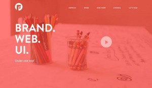
- Back to vibrant colours – Colour will always be married to web design practices, however, the popularity of vibrant colours specifically will ebb and flow as trends change. As such techniques are cyclical, we’ll likely see a return of some older techniques that have been reinvented. For example, perhaps gradients will make a comeback and breathe new life into the bright colour trend. See this article for more information: Web Design Trends 2015 & 2016: Fearless Colors
- CSS3 will finally impact layouts – Browser support for CSS3 has been growing over the past couple of years, and we’re finally reaching a stage where some of the fancy new CSS3 layout modules can be safely used in the wild. Of course there’s still a place for polyfills and fallbacks, but the likes of CSS3 Flexbox (Flexible Box Layout) can be handled by the latest releases of all the popular browsers. It is safe to say that the likes of Flexbox wont be revolutionising the aesthetics of layout in any dramatic sense – Flexbox offers an easier solution to a layout paradigm that’s been in use on the web for a long time now – but it will make for faster-rendering pages that are easier to maintain, and a lot fewer hacks, so it is quite possible that we’ll see more creativity in layout as a result.
- Illustrations not photographs – sometimes you need something more relevant than a piece of nice stock photography. We’re coming to the end of a period where a good proportion of websites feature a photo header that stretches across the viewport. We’re expecting this to be in the form of illustration over photography, because with illustration it’s often easier to place yourself in a scene than it might be when a photo features horribly well-dressed, perfectly manicured models. I can hear you protesting that that’s exactly what your life is like, but for the majority of people it’s a falsehood that doesn’t align with their own experiences, and they’re wise to the differences!
- Flat design stays but will evolve – multiple devices to look at the same websites combined with harder to impress audiences mean that flat design is here to stay with some evolution.
- Typography will get bolder – The past couple of years has seen a total transformation in the typographical landscape online as web fonts have become accessible to all, and as a result we’ve already seen a dramatic shift in the way type is rendered online. Colours have remained muted on the whole, and a combination of designers and brands becoming bolder, alongside refinements to fonts and a resurgence in appreciation of good typography leads us to conclude that 2016 will be marked by a lot of colour, and a whole lot of type!
- Page height reductions and return to scrolling – Placing all your important elements above the fold is now a well-known myth. Furthermore, almost everyone is accustomed to long scrolls thanks to mobile devices. The technique works especially well for sites that want to lure users through storytelling, and you can still mimic a multi-page site by breaking the scroll into clear sections.
Further reading
6 Web Design Trends You Must Know for 2015 & 2016
Web Design Trends 2015 & 2016: Fearless Colors


